Logodesign and branding for „Susanne Rademacher Coaching“
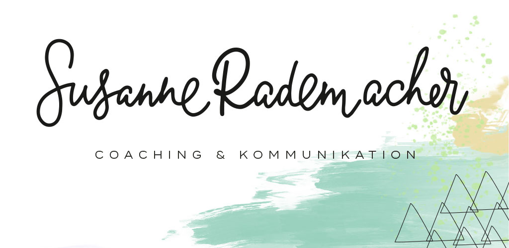 Viele kennen Susanne Rademacher durch ihren Hochzeitsblog „Lieschen heiratet“ und wissen garnicht, dass das Bloggen nur ein Teil von Susannes Alltag ist. Ursprünglich kommt sie aus der Werbung, 2011 hat sie ihr eigenes Beratungsbüro „Fleißiges Lieschen“ für PR, Social Media und Blogger Relations gegründet. Hier hat sie Kunden aus dem Lifestyle und Food-Segment betreut. Nebenbei schreibt sie als freie Autorin und beitreibt zusammen mit Pinar Sahin die Hochzeitsgesellschaft. Nebenbei hat Susanne noch eine Ausbildung zum systematischen Coach absolviert – ganz fleißiges Lieschen eben. 2017 ist nun für Susanne das Jahr, in dem sie alle miteinander verbindet und unter ihrem eigenen Namen, „Susanne Radermacher – Coaching & Kommunikation“, als Business Coach und Kommunikationsberaterin für Kreative, Existenzgründer und Unternehmen tätig ist. Im Zuge dieser beruflichen Veränderung, bat Susanne mich, ein neues Logo und passendes Branding zu entwickeln.
 Björn wanted a new design for his business that would really communicate his values and set him apart from all those other wedding photographers. We analyzed his style and realized that he was not the typical wedding photographer, all set in pastels, watercolor washes and flowers. Very far from it, actually. He defined himself as a gentleman though and through, usually wearing a suit and a bow tie when he was shooting a weddings. So we created a black and white design for the new branding around this manly feel. The new design would be very reduced in color and just use black, white and gold. The feel we wanted to create was one of casual elegance.
 A couple of month ago Johan and Fredrik, the two guys behind Juvelan Jewelry, contacted me. They were looking for the right partner to rebrand their company. Their wish was to upgrade the already existing logo, give it a facelift and add some value and meaning. At the same time they realized that it would`t be done with just a little something added to their logo and it was pretty clear from the beginning, that it would be a complete overhaul. They accepted my offer to take them through the branding process step by step and allow growth and major changes. They were really the best customer a designer can dream of, as they were so open minded and totally allowed me to explore…
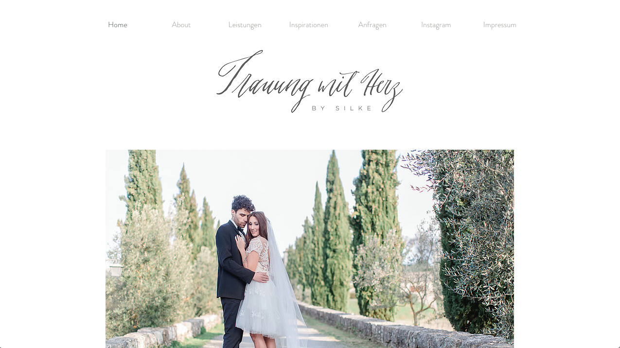 Ich freue mich so, endlich 2 neue Logos zu zeigen, die ich für die liebe Silke Hechler entwickelt habe. Silke ist Hochzeitsplanerin und kreiert wahre Traumhochzeiten für ihre Kunden. Im letzten Jahr hat sie sich zusätzlich als Treurednerin weitergebildet und mit Trauung mit Herz ein neues Unternehmen gegründet. In diesem Zuge sollte auch der Look der beiden Unternehmen überarbeitet werden. Der Wunsch war es, 2 Logos zu entwickeln, die einzeln funktionieren, aber dennoch gut miteinander harmonieren und so eine gemeinsame Marke bilden.